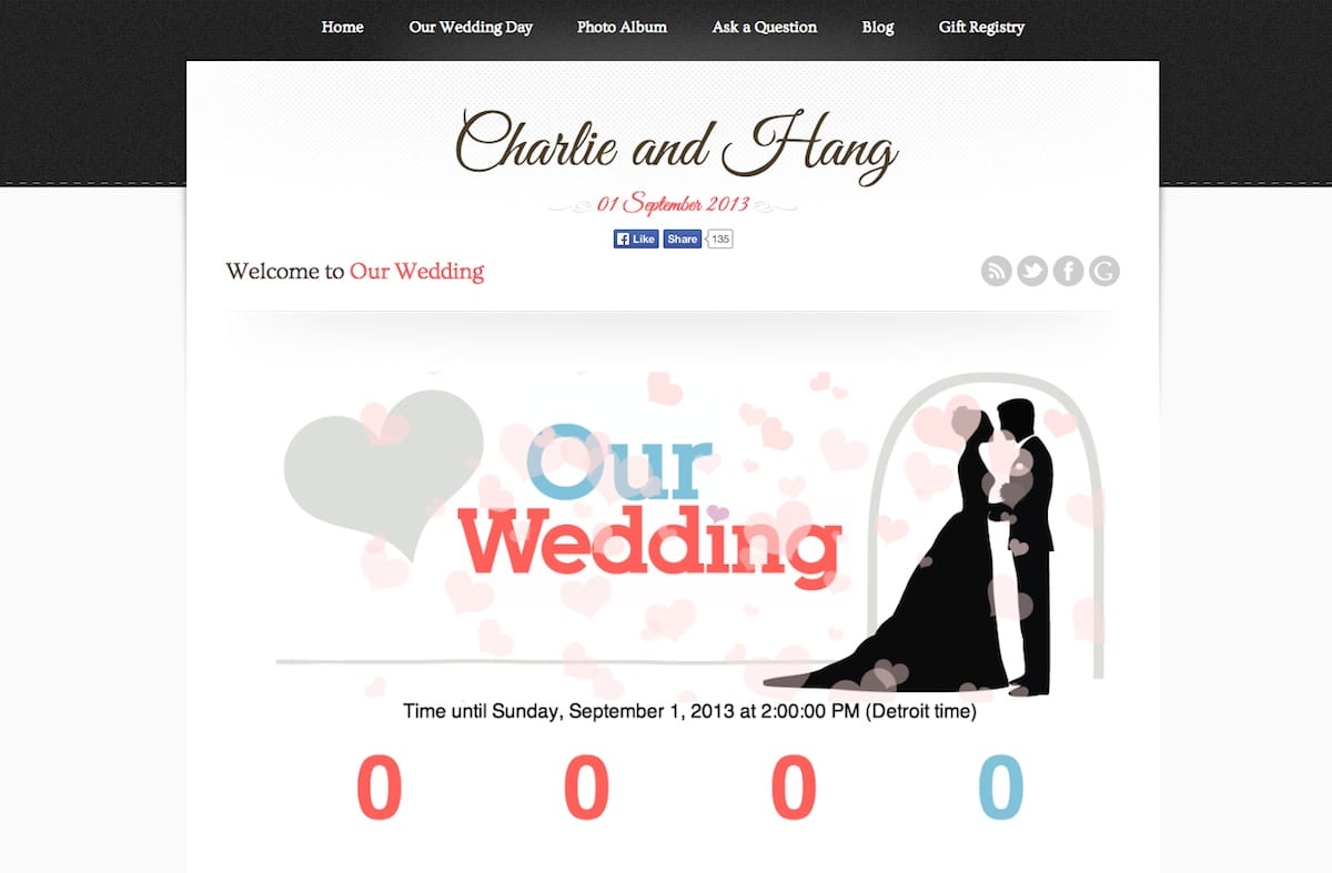
CharlieandHang.com is my wedding site (for myself and my wife). The site showcases a lot of great features that allow couples to share their special day with their friends and family, and has a giant countdown to the day on the front page (which is now all zeros, because we were married September 2013).
As far as features, the home page allows a super-clean showcase of information that is vital to any wedding website: Who’s the groom? Who’s the bride? Where is the ceremony? Where is the reception? Where is the gift registry? All important questions, with answers available right on the front page.
Along with showcasing information in a clean and responsive site layout (everything except the counter on the front page is responsive, and looks great on mobile devices), the site also showcases a photo album, which can be searched through and filtered as needed. Lightboxes are installed so that each photo can be viewed larger without having to load additional pages, and can be cycled through without additional page loads as well, just as any gallery should be.
Although it was never utilized by site visitors, there is also a “questions” section, which acts as a forum for anyone to ask questions for the couple and get answers by them.

